On the eve of the outcome of the Federal Open Market Committee's (FOMC) two-day policy meeting (including a press conference from the maestro himself, Ben Bernanke), investors were betting on a favorable outcome. Based on the market's behavior since May 22, I must assume investors want reassurance that any "tapering" in the Fed's bond-buying program is not imminent and that's how they're placing their bets. By the numbers: The S&P 500 (SNPINDEX: ^GSPC ) and the narrower, price-weighted Dow Jones Industrial Average (DJINDICES: ^DJI ) rose 0.8% and 0.9%, respectively.
Consistent with those gains, the VIX Index (VOLATILITYINDICES: ^VIX ) , Wall Street's fear gauge, fell 1.1%, to close at 16.61. Although the VIX has declined on both days this week, the aggregate decline -- roughly 3% -- is small. Implied volatility is holding pretty firm, reflecting the high degree of uncertainty among investors with regard to tomorrow's outcome. (The VIX is calculated from S&P 500 option prices, and reflects investor expectations for stock market volatility over the coming 30 days.)
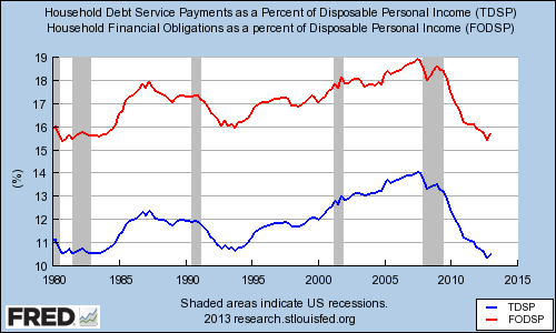
What part of income goes toward debt?
What does the FOMC policy meeting have to do with ordinary Americans? Here's an example: The Fed released the data on Household Debt Service and Financial Obligation Ratios for the first quarter yesterday. Both of these ratios are a measure of the proportion their income Americans spend on meeting financial obligations, or to be more precise:
The household debt service ratio (DSR) is an estimate of the ratio of debt payments to disposable personal income. Debt payments consist of the estimated required payments on outstanding mortgage debt and consumer debt.
The financial obligations ratio (FOR) adds automobile lease payments, rental payments on tenant-occupied property, homeowner's insurance, and property tax payments to the debt service ratio.
It turns out that, although both ratios ticked up last quarter, to 10.5% and 15.7%, respectively, the previous quarter's values were the lowest on record since the series' inception in 1980. The following graph illustrates that the DSR (blue line) and the FOR (red line) remain very low, by historical standards:
How did these ratios get so low when they were at historic highs less than six years ago, having peaked in the third quarter of 2007. Have Americans repaid or (or defaulted on!) that much debt? That's part of the answer. The blue line (left axis) in the graph below is the same household debt service ratio from the previous graph. The red line (right axis), on the other hand, charts per-capita mortgage and consumer debt on an inflation-adjusted basis (May 2013 dollars):

Household debt has certainly come down from its credit bubble peak, but not as fast as households' debt service ratio. The missing variable? Interest rates, which plumbed historic lows over the same period. However, the interest rate cycle may now be turning -- less than a week ago, the 10-year Treasury yield hit a 14-month high. Over the months and years to come, the Fed will want to try to engineer an orderly rise in interest rates to avoid a shock to financial markets and households. That will require very nimble "policy hands" and good communication. Tomorrow is a good test.
If you're an investor who prefers returns to rhetoric, you'll want to read The Motley Fool's new free report "5 Dividend Myths... Busted!" In it, you'll learn which stocks provide premium growth and whether bigger dividends are better. Click here to keep reading.
No comments:
Post a Comment